How To Make Your Resume Standout (Straight from a Recruiter)

Throughout my career as a recruiter, I’ve interviewed hundreds of candidates and reviewed thousands of resumes. I’ve seen it all. From the dreaded use of Comic Sans to a resume that was NINE pages long. NINE. I’ve also seen some really beautiful, concise, and creative resumes. Along the way, I’ve picked up on what makes for a bad resume, a good one, and a resume that really stands out from the rest.
Do Your Research
Before you sit down to create or update your resume, do your research. Comb through the internet to find job postings, both for the roles that you’ve had and the role that you want. It helps if these are from companies that have a culture you want to work for. For example, if you want to work at a tech start-up, don’t pull up job descriptions at the City Water Department.
Review those job postings and jot down all of the role-specific keywords you come across. You will use these key skills and duties throughout your resume to catch your future employer’s eye and to get chosen by applicant tracking systems.

Summarize Each Role
Using your list of relevant and marketable words, start to craft a summary of each of your roles. This should be no more than two sentences. After reading this, your reader should be able to clearly understand what you did and where.
“Created digital engagements that attract visitors to specific client events using a variety of emerging technologies. Managed 20+ accounts to lead various designers, animators, writers, fabricators and engineers to ensure that each event’s digital experience is visually striking and meets our clients’ needs.”
Get Specific
Under the intro to the role, in four to six bullet points, describe your impact on the job. This is where you are telling the reader how amazing you were in this position. This is not the space to list every responsibility you had in the role. It should never, ever read like a job description. Because, frankly, that’s super boring to read and pretty obvious to a recruiter. You only have so much space on your resume, use it to stand out from the crowd.
What to include in your bullet points:
Achievements: Tell the recruiter what you did in this position that could benefit their company. Highlight your achievements while in this position, and use action words, i.e. “composed” and “constructed” instead of the passive “made”.
Leadership: Have you taken on a special project? Do you manage a team? Did you head up a taskforce? Make sure this is known to the reader. Recruiters and hiring managers aren’t just looking for someone that can do the job, they are looking for leaders to join their company.
Measurable Results: If you have specific numbers to quantify any accomplishments, use them! You might have to do a little math to get numbers or percentages that really show how great you are but this is the biggest difference between a resume that reads like a job description and a resume of an accomplished candidate. Examples:
Oversee the effective use of production budgets from $2,000 to $10,000.
Helped clients cut costs by 12%
Increased revenue by 25%
Numbers are key. But even if you don’t have a job with quantitative data, think of other ways to explain your role through numbers. Examples:
Managed a caseload of 25 clients
Worked with clients across 15 states
In 2018, provided approximately 2,000 hours of Executive Coaching
Tech Skills: Share any software or computer programs that you are familiar with, especially if they are frequently used in the industry. It’s good to let the hiring manager know that they won’t have to spend time training you on the programs they might use.
Links: Include links to relevant information – your portfolio, examples of your work, press, etc.
Now that you have the wording to illustrate your expertise and experience, you need to plop those beautiful words into a crisp, clean, and easy to read resume layout.
Columns
Think of your resume in three columns. The first column, on the left, should contain your complimentary information, i.e. education, languages, certifications, skills, etc. The other two columns should contain your employment history and on the left. This makes it very easy on the reader to find the information they are looking for. If it’s too hard to find, they will toss your resume in the “No” pile real quick. If you’re using Microsoft Word you can create columns like this with tables. If you’re confused by this, buy a template, but more on that later.
White Space
The more white space you have on your resume, the easier it is to read. The easier it is to read, the more likely a recruiter will read it. (I can’t put enough emphasis on this.) If your resume is crowded with text, you need to go back and take out the general, obvious, and unrelated information.
Splash of Color
If you’re like me and seeing a black and white resume makes you yawn, I feel you. To add a splash of (professional) color to your resume, you can choose a third color to create emphasis, i.e your name, headings, or job titles. Stick to primary colors that are easy to read - blue, green, red.
For some industries or positions, even a little color would be seen as unprofessional. In this case, I still recommend a slight color variation in your resume’s text. To make it easier on the eye, make your headers black, and make the text underneath a dark charcoal grey. Your reader probably won’t even notice the difference in color, but it will be easier on their eyes, which they will subliminally thank you for.
Icons
Unlike color, icons are a far less controversial way to bring creativity to your resume. You can add icons to the section heads (education, experience, skills). The personal/contact information is another great place for icons (email, phone number, social media handles). One time I saw a resume with six flags, one for each country that they spoke the language of. Impressive and creative! You can find a ton of icons at Flaticon.
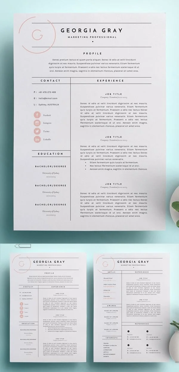
Templates
Canva is a really great tool for designing fun, unique resumes. The templates come with icons, color schemes, and font pairings, taking out a lot of guesswork for you. But depending on your industry, Canva’s templates might be too fun. You can also find resume templates on Etsy or Creative Market, ranging from traditional to fun.

Keep it to One-Page
Go more than one page. Remove roles that are unrelated or more than 10 years. Sorry, but no one cares about your internship 8 years ago. It’s just not relevant. And it’s a waste of the reader’s time. If you’re making me decide which roles are relevant and which aren’t, it’s going to be too much work. And you want to make it as easy as possible for the reader.
And no matter how long your resume is – one or 63 pages – take out your references. Contacting your references is usually one of the last steps. Regardless, if the employer wants to contact them, they will ask you, I promise.
